Happy birthday DEBATIN – how DEBATIN’s look has changed over time

Over the 100 years of our company’s history, our product portfolio and production sites have changed. They’ve moved with the times, adapted to changing requirements and set new standards in the industry.
And it’s not just the products… naturally, DEBATIN’s look has also changed over the last decades.
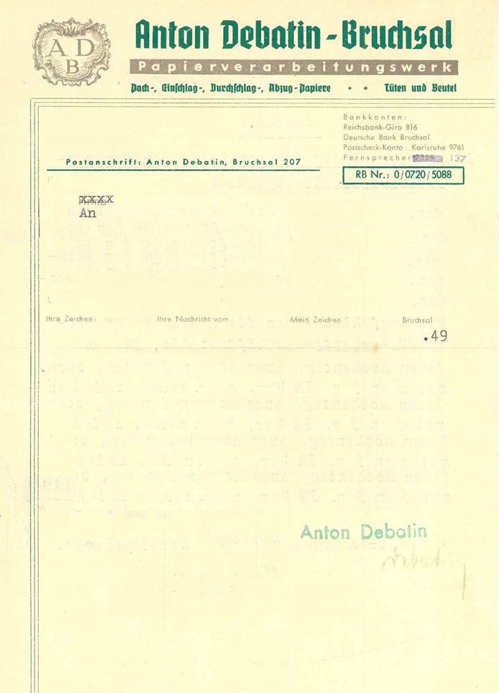
ADB – Anton Debatin Bruchsal: crest & font
When crests and coats of arms first became popular back in the Middle Ages, they were reserved for the nobility only. Later on, however, family crests were also conferred on or adopted by ordinary families, reflecting their respective values, bonds and origins.
This probably explains why Anton Debatin chose to adopt a crest for Anton Debatin Bruchsal, the company he founded in 1935. The new crest represented the company and appeared in a variety of places – on letterheads, for example. The original ADB crest was worked into the window glass of an office in the company’s premises on 34, Schnabel-Henning Str. in Bruchsal, and has been preserved through to the present day. Anton Debatin chose a Gothic Fraktur font for his crest. This kind of writing system had been used in printing ever since the first letterpress was invented. From the middle of the sixteenth century to the beginning of the twentieth century, they were amongst the most commonly used fonts in the German-speaking world. A well-known example is the Gutenberg Bible.
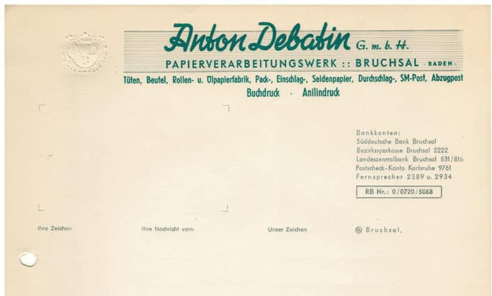
In 1941, an edict was passed to officially discontinue Gothic-style writing systems in Germany. Schools stopped teaching children how to read and write them, and they gradually disappeared from public life. However, it was not until 1951 that DEBATIN adopted a cursive font. The original DEBATIN crest was embossed and became less important.
DEBATIN remains grounded – despite new design movements
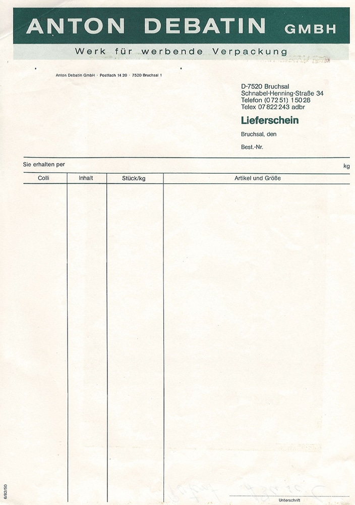
After the Second World War, most design grids were influenced by Bauhaus typefaces (form follows function). Large companies began using graphic designers or agencies to develop and design their corporate communications (corporate design, advertising, PR materials). During the 1960s and 70s, “New York Style” arrived in Germany, opening the door to completely new and unconventional ways to compile images and typefaces, form and content. However, DEBATIN did not move away from its “handmade” style until 1982.
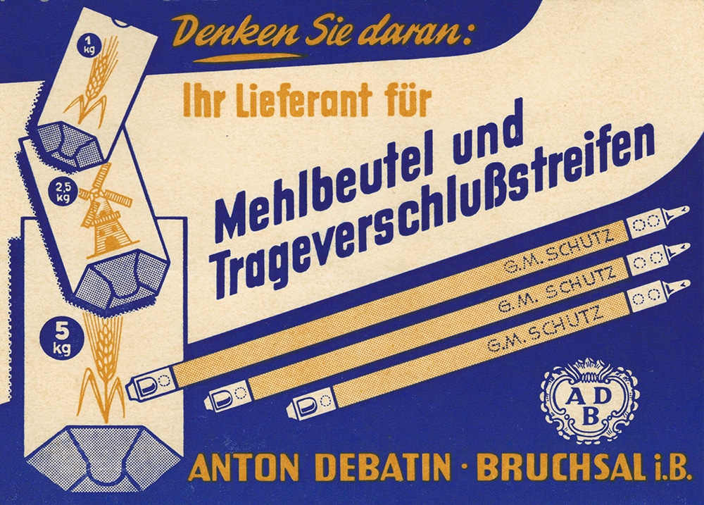
DEBATIN “flour bag” advertising mail
DEBATIN’s highlight of 1954 was a flour bag with patented fastener that was sent out as advertising mail. Professionally designed and boldly illustrated in blue and orange to catch the eye, it was excellently in keeping with the times and met customer expectations in terms of clarity, legibility and typeface presentation as the main element.
Technological progress as the basis for new designs and methods
In the 1980s, new technology not only impacted the development of products and machines, but also influenced graphic design. New programmes eased people’s workloads, and new photographic and typographical techniques were invented.
New place, new look: DEBATIN flaunts its first “real” logo in 1983
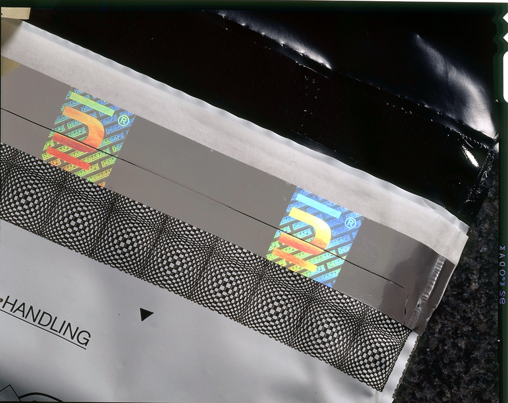
The first real DEBATIN logo was designed in 1988. Bold and neutral, it was only moderately legible (the letters of the logo appear to melt into each other when printed on fibre paper, though this is completely normal with this method). For the font, the company chose a sans-serif typeface with uppercase letters. The ingenious DEBATIN signet dating from 1988 was printed onto the DEBASAFE® hologram band and is still in use today, albeit in a more modern version.
Internet and Web 2.0 applications
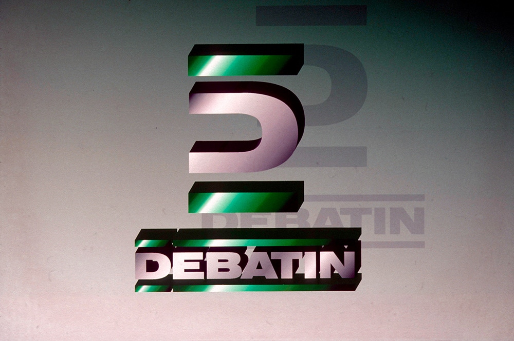
In the 1990s, the DEBATIN logo was updated to adopt the popular 3D-style of the day. Slide shows were used to help with presentations. Although these now seem rather outdated and cumbersome, they were highly modern at the time!
Internet and Web 2.0 applications have opened up new possibilities, but also place new demands on graphic design. Logos now have to be adaptable and work in all different colours and sizes.
1998
Company presentation as Powerpoint
2004
Company presentation as Powerpoint
2018
Company presentation as Google Slides
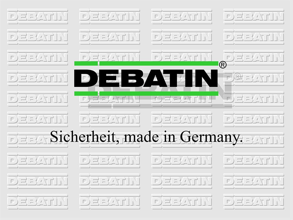
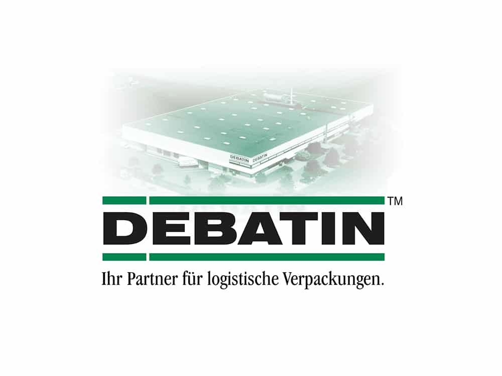
In 2010, the new and minimalist “flat design” style came into fashion. Here the focus is on high-definition colours. Major brands have adapted their logos to move with the times, and DEBATIN is no exception. In 2013, the company gave its logo and image a complete overhaul.
In June, we’ll be showing how we moved from pure print to the web – complete, of course, with a few pretty pictures from our first website! 😊